
Looking for a simple way to increase your revenue?
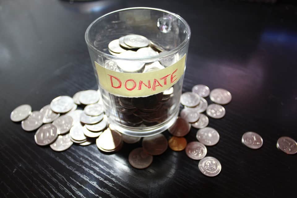
Make donating easy with a “Donate Now” button on your website.
You’ve put a lot of effort into building relationships with your supporters and driving traffic to your site. Now capture that energy by making it really simple for people to find your donation page with a eye-catching “Donate Now” button.
Winning Strategies
 Here are some things to consider when designing a “Donate Now” button.
- Make it Pop—Your visitors are practiced at scanning websites, so you’ll want to catch their eye. Use vibrant colors that stand out, yet don’t clash with your branding and your site’s color scheme. Place your button prominently on the page so it’s easy to see. Check out Creating Web Buttons That Get Clicked for additional tips.
- Make it Easy—Make sure your “Donate Now” button links directly to your online payments page. Provide a simple and direct route—just one click. Also, make sure your online payments page has the same color scheme as your main site, so your visitors know they’re in the right place.
- Make it Repeat—Place your “Donate Now” button on strategic pages on your site, not just one. Consider including it in the sidebar, for instance. It often takes several impressions before a person takes action.
Good Examples
Here are some examples of well-designed “Donate Now” buttons:
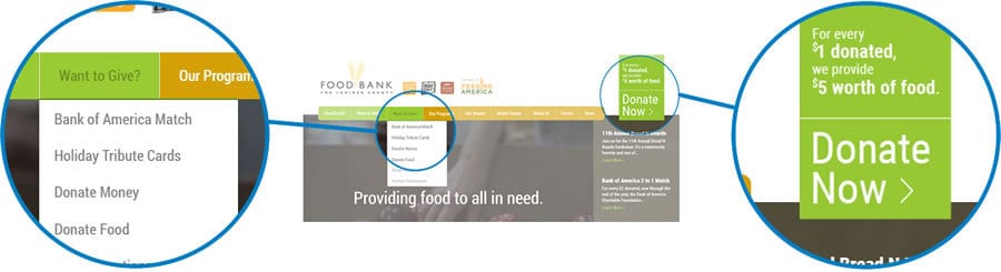
- Food Bank for Larimer County—Big and visible, this “Donate Now” button even provides some concrete detail that illustrates tangible results. As a donor, you see exactly where your money is going and you feel more connected to the cause. The colors coordinate with the color scheme of the site, creating a sense of coherence, which builds trust.
- Paws Atlanta—This site has a “Donate” tab in the main navigation so it shows up on every page. There’s also a “Donate Now” link under Quick Links in the side bar. While a large, well-designed button might stand out more than the link does, it’s still visible and easy to navigate.
- Halo Animal Rescue—Placed front and center, this yellow “Donate Now” button is almost the first thing you see when you land on the home page. It’s echoed in the main navigation with a clustered set of red buttons that show up on every page. Then it’s repeated again with an angled photo in the banner on the home page.
- Community Food Share—Keeping with the purple and gold theme of the site, this “Donate Now” button catches the eye with its gold color and central location on the home page. The same button shows up in the side bar in the sub-pages, providing valuable repetition, which encourages people to take action.
 Creating a “Donate Now” button can be an effective way of increasing your donations. It certainly doesn’t take the place of relationship-building and promoting your cause, but it does provide a direct path to your donation page. With a professional layout, vibrant colors and one-click access, your “Donate Now” button will make it easy for your supporters to make their donations online.
What’s Your Strategy?
How do you use your “Donate Now” button? Have you tried different approaches? What has worked for you and what hasn’t? Share your story in the comments below. We’d love to hear from you.