

You have several buttons on your website that are key to your fundraising activities and general fulfillment of the organizational mission.
Donations, registration, volunteering, surveys—Here are a few tips on creating buttons that will get more clicks.
Current Brand Styles
Your brand standards and guidelines are an important part of the user experience. Building trust through consistency can be an underrated and often overlooked piece of the user experience puzzle, and it’s a vital component of fundraising success in a generally untrusting world.
Most times, button styles will be covered in the brand style guide, but if not, you will want to find the proper balance between context, visual prominence, and alignment with the brand.
Built-in Button Styles
Many website themes—whether pre-built or custom—will have button styles available that are designed to work well with the theme color palette and layout. Most will have style class names or pre-built options within your website editor that you can quickly apply.
CSS vs. Images
Buttons can be constructed via image editing software or coded in stylesheets. Utilizing CSS3 is the most common practice today due to the flexibility, robust styling options and minimized load times. Additionally, CSS3 buttons can easily be built online using a tool like CSS3 Button Generator.
Image button benefits
- Create a professionally graphic designed button
- Closely control button style details
- Utilize non-web fonts
CSS button benefits
- Flexibility to change the call to action quickly
- Faster loading
- Responsive
- Image hosting not required
- No image editing software required
Call to Action
If possible, stay away from using the standard form call to action, “Submit”. 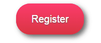 For a more effective button, let visitors know what action will take place when they click and encourage them to take action.
Let’s say you have a luncheon fundraiser scheduled and you have opened online registration for the event. By using the call to action “Register”, visitors assume that pressing the button will submit the information required to reserve their spot at the event.
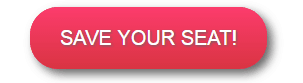 Going one step further, a call to action such as “Save Your Seat”, suggests immediate action is required—you may not get a seat if you wait. While the underlying message is the same—reserving your spot at the event—one call to action is much stronger than the other. This is another great way to create FOMO for your events.
Button Styles/Types
There are many different button styles available and below are some samples of the most commonly used today. When placing the button in the layout, ensure you have enough “whitespace” around it, which will draw visitor eyeballs and help the button stand out.
Flat and Ghost buttons
Flat design has been popular for a number of years and was significantly perpetuated by Microsoft’s Metro design. The minimalistic and efficiency principles of flat design remove any design characteristics that appear to lift elements off of the page.
Ghost buttons are a version of flat design, where the button background is transparent—revealing the image or color behind the button. And, for best results, ghost buttons include an outline to create a recognizable button shape. Ghost buttons allow a more content focused experience and can be much larger without being in-your-face or annoying.
The following image includes both examples on one page. This instance provides more emphasis—hence more importance—to the flat orange button while the ghost button becomes a slightly more subtle secondary call to action.
Raised Buttons
Today’s raised buttons—especially within material design—provide a sense of clickability. With gradients and various shadowing effects, these buttons stand out from other design elements.
Image
 Image buttons are vector files, typically created in an image editing software, that utilize the html image tag to load. The files don’t need to include an image—the button type refers to the required use of the <img tag.
Image buttons allow for more freedom of design, but can quickly become over-designed or even gaudy if the core objective—user clicks—isn’t the primary focus. Keep image buttons simple, optimized for fast load times and let the design do most of the talking.
Button States
Your buttons can improve user experience by visually confirming when they have indeed found a button by utilizing the focused state (when the mouse has moved on top of the button). For general design, the focus state will change the background, and perhaps, font color as a visual cue.
Button Sizes
Work with your site layout to ensure your buttons are visible on all devices. Whether you have a responsive, adaptive, separate mobile version or no mobile version, make sure your buttons are identifiable on all device types. Call to action text needs to stand out from the button background and be large enough to be easily read. Be mindful of the touch target size—buttons on touch devices should be large enough to click without accidentally clicking a different link or button that is in close proximity.
User Testing
While psychology can be applied to button design, the best way to find optimal buttons is through user testing. First, ensure that you have cross-browser and cross-device optimization. Use browser and device testing services like SauceLabs to review a broad group of browsers, operating systems and devices quickly. Second, incorporate strategic A/B testing scenarios to find color/style/size/call-to-action combinations that work best for your specific audience.
Review and Create Your Buttons
There are many nuances to optimizing button design—including color psychology, contrast, iconography, and various design details—that may be best suited for a professional UX designer. But, a little extra time and effort on the basics can have a significant impact on your conversion rate—those that donate, subscribe, register or buy vs. those that don’t.
Make sure you have a solid call to action and enough size/contrast to be easily recognized on the page.
What buttons have you found to work well?
Share your experiences below!