Spring 2015 Greater Giving Release Notes
Mobile, mobile, mobile. In 2015, today’s bidder and donor are more on the go than ever. Early spring saw a major update to Greater Giving’s Online Payments platform. Your time and your organization’s resources are too valuable to waste on manual processes like taking registrations by phone, follow-up on donations, and credit card processing. And you may be missing valuable opportunities to generate event-based and additional revenue if you don’t have a way to securely accept online donations. Greater Giving Online Payments allows you to register event attendees and securely process credit card registrations and donations via a website.
With many new features it’s hard for us to focus on only the top five, so for this blog post we listed our top ten:
- New Online Payments Home Page: The Online Payments home page had a total redesign along with the tools and reporting section. Added to the Online Payments platform are a number of new resources like Basic Analytics, Recycle Bin and Design Settings.
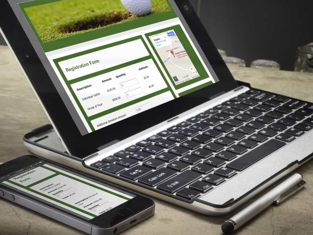
- Mobile and Device Optimized Pages: Pages now auto adjust to the size of the viewer’s device or screen. Online donations and registrations sites now look fantastic on laptops, smartphones, and tablets. Transactions are optimized to give the donor an easy
 experience regardless of their device.
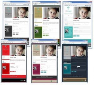
 - Color Themes: Quickly choose between eight separate pre-created color themes. Jump back and forth between multiple color options. Not seeing the exact color theme you’re looking for? Use the color wheel to adjust your specific image color code. RGB/HEX code options are also available.
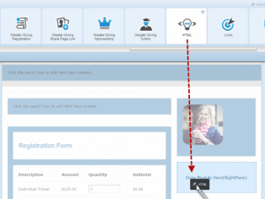
- Drag and Drop: Greater Giving’s new drag and drop menu lets users grab modules and move them from one side to the next. Once a module is selected, the option for where to place it is highlighted below. Once added, the module can then be viewed in Preview Mode to show the user what the page will look like once published. Don’t like where the image was placed? Simply grab the top of the object and move it to another part of the page.

- Page Templates: Page templates come with pre-created colors and stock images. There are over five page templates currently available. You can apply color themes once the page is selected.
- Layout Selector: With eight different layout types to choose from users can design pages with various widths and lengths. Choose a layout for your whole project or just for a specific page.
- Page Footers: Follow Us With an added focus on integrating a group’s social media resources into their fundraising pages, this tool creates icons based on your color selections established for your page or project website. Site options under Follow Us included: Your organization Home Page, Facebook, Google Plus, LinkedIn, Pinterest, Twitter and YouTube.

- Page Footers: About Us Add your team’s Mission Statement or a message about your organization in the About Us section of the page footer. This is also a great spot to leave a comment from this year’s event chairs thanking all those hard working volunteers.
- Page Footers: Contact Us Looking for a way for donors or sponsors to know who to reach out to with questions? Add the group contact into the Contact Us section at the bottom of the page.
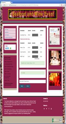
- Page Background Images: In hopes of matching your event theme or event type, a background image can easily be uploaded to your site. Commonly used images include wine corks, photos from previous years’ events, city skyline etc.
