Dramatically improve your guest’s nonprofit fundraiser experience with these tips and best practices for Event Signage.
One of the most important elements of the guest experience at a nonprofit fundraising event is a clear flow through your venue—and that flow is often dictated by the signage posted throughout the event.
The best signs are the kind that guests don’t even notice. They should be intuitive, easy to understand, and placed right where guests will be looking for them while they navigate your venue. Great signage should also reinforce your nonprofit’s brand and offer opportunities to recognize sponsors and sell sponsor benefits.
Sponsor Recognition
How better to sell sponsors on your fundraising event than to offer some high-visibility recognition to your audience? Recognizing sponsors on signs all throughout your event venue is a great high-end benefit you can offer in your sponsorship packages to sell the value of your fundraiser.
When putting together your sponsor packets, be sure to include sign placement as a benefit underneath applicable sponsor packages. You can also designate special opportunities for exclusive recognition on signage and signage recognition in high traffic event areas such as the bar, VIP Reception, and Auction Area. Let potential sponsors know what size they can expect their logo to be, and how many eyes it will get throughout event night.
 Use Event Signage to Communicate with Guests
Not only should your signage direct guests where they need to go throughout the venue, but it offers an opportunity to communicate with guests about what they can expect at the event. Add information about when the auction opens and closes so guests know when they need to place their final bids to any silent auction signage. If you have multiple silent auction rooms, consider noting which package numbers are located where, so guests bidding via mobile device can easily locate items that draw their interest.
Use signs to communicate other important event details, such as how to access the online auction and get their device set up to bid. These are great to have beside and behind registration, so guests who are checked in can get bidding right away. If you can provide this information with a sign, that’s one less thing for your volunteers to worry about!
Directional Signage in Your Venue
Having great event signage not only lessens the burden on your volunteers, but it makes guests happier, too! If they can find what they’re looking for without too much trouble, they can better focus on bidding and supporting the cause.
Tips and best practices for directional signage:
- Make it easy to locate the restrooms.
- Upon entering the venue, guests should see right away how to find registration and check-in.
- Once guests are checked in, where do they go next? Put clear signage sending them to your silent auction room or cocktail hour.
- Make sure to place directional signage leading to the next activity—and use additional signage along the way so guests don’t get lost or confused.
- At the end of your event, make sure to switch out registration and check-in signage. Position item pickup and checkout signage, and position them for guests exiting the ballroom.

 What does good event signage look like?
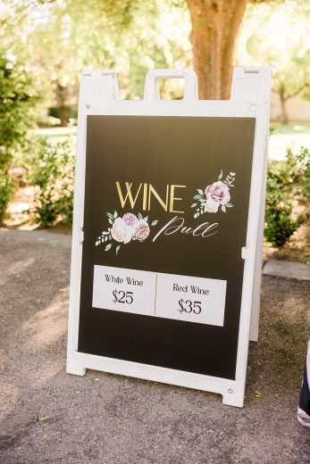
Don’t rely on taping a piece of paper to a door for guests to find what they’re looking for! Use free-standing signs when you can, as they’re easier to spot and more flexible to position.
- Clear and easy to see. Event signage should be as simple and easy to read as possible, even from a distance. Use big text (and big arrows when necessary), so they can be seen even in a room full of people. The text should be as simple as possible, e.g. “SILENT AUCTION” or “VOLUNTEERS.”
- Maintain your brand. Use relevant images and logos on your signs to keep your event branding consistent. For a cohesive event experience, utilize the same fonts and colors as other materials in your venue.
- Location, location! The placement of a sign is more important than you might think. Place your signs in obvious locations that won’t stand in the way of traffic. Great placement areas include both sides of a hallway. In areas with multiple access points or doors, place your sign in a location where someone walking down the hall will see it. Always mark which door is which!
- Over-signage is better than under-signage. An excess of signage will bother a guest far less than getting lost will!
- Use QR Codes to drive the reader to interact with your brand digitally. You can encourage the reader to take a post event survey, bid in your auction, make a donation, sign up for a mailing list, or follow on social media.
Great signage should help guests seamlessly get around your event, without interrupting the atmosphere or the flow of the event. Always try out your signage before the big event, and do a dry run of the guest’s journey through your venue to make sure everything is where it should be.
