Include these elements to keep donors engaged and maintain a steady stream year round donations.
Nonprofit calendars usually experience “ups” and “downs”. The “up” months include the year-end giving season, where donors are inspired to make their last tax-deductible donations for the year. This is also the time when many organizations host their year-end gala to drive even more donations. The “down” months tend to include most of the period leading up to the year-end fundraising bonanza. With a little strategic planning you can encourage year round donations to give your organization some stability.
With the rise of online fundraising technology and virtual events, nonprofits are moving away from the traditional strategy of hosting just one larger event each year. To keep donors engaged, nonprofits are increasingly turning to their websites to help drive ongoing year round donations.
As the digital hub of your nonprofit’s fundraising efforts, your website should be optimized to continuously engage donors for year round donations. Incorporate these six elements into your website to see better fundraising results:
1. Motivational imagery.
2. Intuitive user experience.
3. A conversion-optimized donation page.
4. A compelling “why.”
5. Inspiring calls to action.
6. Mobile-friendly formatting.
Remember, the most effective nonprofit websites prioritize donors’ preferences and motivations in their design and structure. By getting to know your supporters better, you can understand how they’re using your website and how you can improve their experience. Let’s dive in!
1. Motivational imagery
Show the real impacts that year-round donations can have on your mission by using compelling images within your website.
Choose images that show interactions between people, whether it’s your volunteers and constituents or your donors mingling at previous fundraising events. People are more naturally drawn to images with faces. Include images of your mission in action to build credibility and trust among supporters.
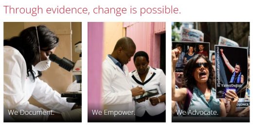
For instance, check out the Physicians for Human Rights homepage:

Right away, visitors can see what their mission looks like in action with images. These images depict the three aspects of their operations: documenting human rights violations, empowering frontline human rights defenders, and reforming laws and policies that contribute to human rights abuses.
When deciding what images to include in your nonprofit’s website, think about what will showcase your mission most effectively. Use A/B testing to determine which images are most effective for engaging visitors. A/B testing involves creating two different versions of a webpage. This practice assesses which drives more engagement and conversions.
2. Intuitive user experience
Your website should be constructed so that visitors can find what they’re looking for as fast as possible. Facilitate this information-gathering process by enhancing your site’s user experience (UX).
User experience is the way visitors interact with your website, from the moment they arrive on your site to when they click away. This might involve browsing your event calendar, reading your blog, donating through your online giving page, or using your contact form to get in touch.
Improve your UX by ensuring that your site has:
● Simple navigation. Keep your navigation menu simple, with no more than five main menu items. Ensure your navigation menu includes a donate button. This will get visitors directly to your online donation page quickly.
● Accessible content. Incorporate accessibility best practices as you design or update your website to ensure you offer a positive user experience for all users. Keep in mind to make it easy for users, no matter their age, ability, or device. For example, ensure all images include alt text, provide a transcript or closed captions for videos. Choose text colors that contrast with the background, and use hierarchical page structure to make content easy to read.
● A fast load speed. The recommended website load speed is a mere two seconds. If your site loads any slower, you start losing visitors at a rapid pace. You can improve your load speed by optimizing your images, reducing redirects, using browser caching, and cleaning up your code.
If your website doesn’t offer a convenient, pleasant user experience, visitors won’t be inclined to continue browsing it, let alone donate some of their hard-earned money. Enhanced user experience ensures that your website is open and inviting for all members of your audience.
3. A conversion-optimized donation page
The most important fundraising element within your nonprofit’s website is your digital donation page. This form gives supporters an easy way to donate 24/7 using any device they want.
To ensure your page is optimized for driving donations, you should:
● Simplify the donation process. Only ask for the necessary information— don’t bog supporters down with tons of additional information fields.
● Offer opportunities for recurring donations. Provide an easy way for donors to turn their one-time gifts into recurring contributions right within your giving form.
● Offer suggested giving amounts. Suggest a few donation increments for supporters to choose from. Giving smaller donors an idea of the donations you’re looking for can encourage them to give in larger amounts.
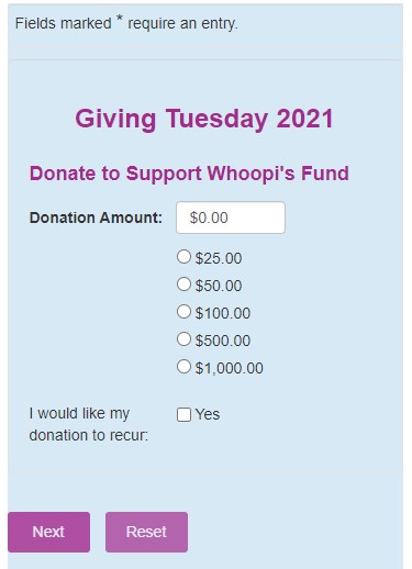
Check out the Homeward Pet Adoption Center for an example of a well-designed, streamlined donation form:

The form provides an opportunity to contribute a recurring gift as well as several suggested donation amounts right off the bat. The rest of the form is equally straightforward, simply asking donors for their billing and payment information. You can always give the option for donors to create an account with their personal information. Requiring donors to create an account in order to donate may deter some supporters who are short on time.
A well-organized, streamlined giving page, makes it easy for donors to give and become recurring supporters.
4. A compelling “why.”
Most supporters visit your website intending to learn more about your organization and determine whether they’re going to donate. Kanopi refers to this process as the donor journey— the steps donors take to go from initial awareness to research to donating. To facilitate this journey, ensure your site is optimized for telling your organization’s story.
Include elements of your nonprofit’s story on multiple strategic pages. Your donation page and about page are perfect opportunities to tell your story through images. Use real stories and statistics to make your case for support.
If you don’t know where to start when it comes to telling your story, think back to the basics of storytelling that most of us learn in elementary school. Your story should have a main character as well as a driving conflict and eventual resolution. Use interviews with individuals your organization has served, staff members, and volunteers to determine the main characters of your story.
The conflict will be the issue your organization seeks to solve. Seek a solution that effectively communicates your strategy for combatting or solving the problem. Finally, end with a resolution where you bring donors into the picture— let them know that by contributing to your fundraising efforts, they are a part of the solution.
Allow supporters to make the connection between their gifts and the real people your organization helps. When donors know the real impact of their gifts, they are much less likely to abandon the donation process.
5. Inspiring calls to action
After you’ve created your well-designed donation page, guide website visitors to the form so they can complete their donations year-round.
Re:Charity’s web design best practices guide recommends placing your donation buttons in prominent places, such as your site’s top menu and home page.
You can also use calls to action throughout your blog posts or services pages. A call to action is a brief motivational statement intended to inspire visitors to immediately take action. Whether it’s donating, signing up for your email newsletter, or registering for a volunteer opportunity now is your chance to inspire action.
Make the language of these buttons and phrases inspiring and specific. For instance, instead of “Donate Here,” you can say “Give $5 Now to Support Our Cause” or “Join the Fight.” Your goal is to get website visitors fired up to support your cause. A successful appeal that makes them feel like integral partners in your organization’s success.
6. Mobile-friendly formatting
Lastly, ensure that viewing your nonprofit’s website is an equally enjoyable experience for smartphone users and laptop/desktop users alike.
According to this nonprofit fundraising statistics page, half of all nonprofit website traffic last year came from mobile and tablet users. This underlines the crucial importance of making your website and online donation page mobile-friendly.
To ensure your site is mobile-optimized, choose a mobile-responsive website theme. Also, review your website in the mobile view to ensure each element appears correctly. If you’re seeing any formatting issues, here are a few easy changes you can make:
- Resize your photos so they don’t appear distorted in the mobile view.
- Simplify your page structure to make your site easier to navigate.
- Increase your font sizes to ensure your content is legible on smaller devices.
- Eliminate or reduce the number of pop-up messages or ads.
Mobile fundraising will only grow in importance as more people rely on their smartphones for most of their internet browsing. Make sure you prioritize your mobile fundraising capabilities to meet donors where they are and take advantage of this year round donations trend.
With these website elements, you can create a fundraising culture within your organization that facilitates year round donations. You’ll be able to design your website to be just as engaging for first-time visitors as it is for long-time supporters. Your online giving form will act as a tool for gathering donations on an ongoing basis to supplement your major fundraising events.
