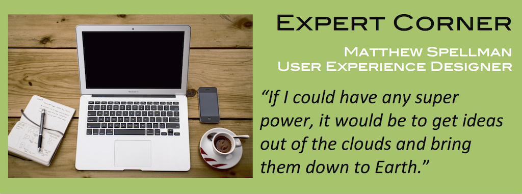
We sat down with Greater Giving’s Matthew Spellman, User Experience Designer (UX) to talk about how the company is designing out products to be more user-friendly for clients, as well as discuss tips Nonprofits should keep in mind when designing their campaigns and websites for their donors and supporters.
What is a User Experience Designer?
Matthew: User Experience is about finding ways to improve the look and feel of a website or product; helping it to feel seamless and intuitive. A user experience designer tests various aspects, and ultimately strives to create a more natural human experience for any product or website.
What is your biggest advice for nonprofits?
Matthew: Improve your website by adding a payment form! The form accepts donations and event registrations. It’s a simple addition, yielding stronger communication and a chance to introduce your cause, mission, or campaign, as well as accept year-round funding from donors who want to support you online.
Payment forms often look differently than the organization’s main website because companies have different designs (skins) to run the transactions. It often looks like a completely separate website, which can be off-putting for donors. When supporters make a monetary donation, it’s important to maintain their trust by keeping the same tone and feeling of the site on the payment form, to be consistent and secure. To achieve this, choose a payment forms platform that allows you the customize the look and feel to mimic your main website.
Here’s a tip for the design: use colors that are warm and vibrant. Try to avoid making it look serious or stuffy. Instead, make it look fun and easy to donate! This shows up in the images you use and the color schemes you choose.
Lastly, include some of the same energy and spirit of the organization’s message on the payment form page. Remember, people visiting the website might be looking for ways to get involved. Donating is a great first step!
What’s on the horizon for Greater Giving?
Matthew: There is a lot we’re working on behind the scenes right now: exciting new features we are developing to allow customers to create great looking payment forms with very little hassle. We’re fully incorporating our best practices and user design knowledge to create customizable payment forms.
If you could have any super power, what would it be?
Matthew: I’ve always worked hard to help get people’s ideas out of the clouds and onto solid ground. If I could have a super power it would be to do that better!

Great post on helping organizations raise more in donations and find potential volunteers. I was just reading about some usability test results for this topic that may also be helpful http://nngroup.com/articles/donations-nonprofit-charity-online/