This information and more comes from our webinar, It’s Beginning to Look a Lot Like Auction Profits.
Auction packages are a great way to maximize your efforts and your revenue. By combining several items together, you can create a one-of-a-kind experience that will attract your guests and drive up bidding. But how do you describe these packages most effectively? Here’s a list of Do’s and Don’ts to help you get the most out of these wonderful revenue gems.
Top 5 Do’s
Include Restrictions, Blackout Dates and Expirations
It’s very important to be upfront about any restrictions on the auction package. Guests will want to see when they can or can’t use the item. This is especially crucial if someone donates a vacation home they own, as there are bound to be dates the donor will want to use the home. Expirations are also important. Some items need to be used within two years of the event. Other donors don’t state an expiration. If there is one, be sure to include it in the description.
Thank the Donor
Your donors went out of their way to support your auction. Make sure to give them the recognition they deserve. This is one of the few ways you can say “thank you” publicly. Be sure to thank all the donors of the individual items included in the package.
Use Bullet Points
Make it easy for your guests to understand what’s included in the package by listing the individual items as bullet points under the description. This is crucial as it helps your guests decide which packages to bid on. List each item as a separate bullet point:
- 3 night stay at Marriott Waterfront
- Car rental for 4 days
- Dinner for two at Ringside Steakhouse
Create Multiple Displays
Display your auction package descriptions in many ways and in various mediums: online, in print, in advance of event and on event night.
TIP: To find royalty-free photos that can be used for websites and marketing materials:
- Use the Creative Commons to search for your topic.
- Even free images have conditions. Familiarize yourself with attributing sources and licensing conditions
- Choose the photo that best suits your needs.
Use High Quality Photos
Help your guests to visualize themselves participating in this package by using 1-2 high quality photos. You can put these on the silent auction displays and on slides during the live auction. Just don’t include anything in the photo that will mislead people about the package.
The quality of the photos is important, especially if you’re displaying them on the big screen during the live auction. You don’t want a photo someone took with their smart phone. Stock photos are an easy way to obtain quality images and there are several sources of royalty-free photos on the web.
Top 5 DON’Ts
Don’t Be Lengthy
Your guests need to quickly and easily understand what the package is and what’s included. Be brief. Get to the point. Create a short, simple description and list the package items as a bulleted list.
Don’t Use Low Quality Images
You want your guests to be able to picture themselves having or using the item you are describing. Grainy images aren’t effective. You can get free, non-copyrighted images as described above. Make sure the images are still crisp and clear when displayed on an auction slide or printed on a large sign board. In the Google Image search page, you can filter images by size. Choose Large (not small or medium). Images over 1000 pixels wide will work on any slide or document for printing.
Don’t Mention Items Not Included in the Package
Edit your description to eliminate things that aren’t part of the package. You don’t want to mislead your bidders.
Don’t Get Too Creative
Be simple and direct. Don’t leave your guests wondering what’s actually in the package. If you start to get funny or quirky in your package titles or descriptions, have at least three other people (of different ages) review them. Not everyone will understand a pop culture reference or have the same sense of humor. Getting too creative can backfire.
Don’t Clutter the Description
Make your visuals uniform and consistent. Use the same font and size for the body text of all your descriptions. The same is true for the bulleted list of items. You can (and should) use a contrasting font and a larger size for the description titles, just make sure they are all the same design. All graphics should be consistent in their size, shape and placement. By making your design uniform, you help your guests focus on what’s actually in the package itself.
Description Example
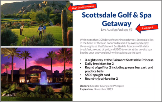
This is a great example of a package description:
- Package title is direct and clearly describes what the package is.
- Package number is clearly visible so bidders know when it will come up in the auction.
- Description paragraph is easy to read and explains what’s included. It also suggests why you should buy the package.
- Bullet points are bolded and indicate the items that are actually included in the package.
- Donors are listed. You can include their logos as well.
- Expiration date is listed.
- Two high-quality photos take up half the slide and help you see yourself using the package.
Auction package descriptions are not hard to create. In fact, once you’ve developed your template, it’s just a matter of putting in the correct information for each one. By making the descriptions simple and straight-forward, you not only make it easier for your guests to find what they like, you make the work easier on yourself.
