What Does a Great Ticket Sales Page Look Like—and How Much Information Should You Give Your Guests?
It’s easy to overload your registration and ticket sales page with unnecessary information, and equally easy to leave it completely devoid of details at all. In this post, we’ll give you some tips on what to include on your ticket page to convince your potential attendee to buy a ticket—and what confirmed guests can simply peruse at their leisure.
Sponsor Logos
Since one of the biggest benefits you can offer to potential sponsors is exposure to your audience, it’s key to place those sponsor logos on your ticketing page. Be sure to tell your event attendees who helped make this event possible!
Buy That Ticket
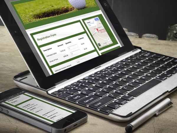
The most important feature of your event registration and ticket sales page is to make tickets and tables available for sale. But there’s more to it than that.
Create FOMO for your event that will engage your visitors and build a sense of missing out if they aren’t in attendance.
Also let people know before they buy tickets where the event will be held, the dress code, and whether you’ll offer any additional services (like child care or valet parking).
Include an option for folks who can’t attend the event to either make an item donation, or a monetary donation by adding a donation box to the bottom of your event registration page, or to pop in a link to another page (such as the item donation page).
Remember: when setting up your ticket page, you’ll find additional fields to fill in that guests will only see in their email receipt, after purchasing a ticket. If there’s anything you only want confirmed guests to know—that’s where to do it!
Sell Sponsorships, Too
The other purpose of prominently displaying your sponsor logos? Showing off what you can provide to other future, potential sponsors.
Add another registration page to your website focused on selling sponsorships—and include information about what benefits each of those sponsorships provide the sponsor.
Procure Item Donations, While You’re at It
A potential event guest is also a potential item donor! Include a link on your event website to your item donation page, so visitors who can’t attend can donate something, instead.
Receiving item donations online is also a big time saver—instead of having to enter each item donation manually, you can simply import them from the event website into your database, and skip the whole data entry step.
FAQ
This is the page that is typically overlooked by nonprofit organizations, but probably one of the most valuable to your guests—especially if you’re doing anything new or special at your event, such as mobile bidding.
What sorts of questions should you address in an FAQ?
- Where to park
- Directions to the event venue
- What ticket-holders need to bring with them to get into the event
- How to set up mobile bidding, or get started bidding online in advance
- Dress code
- Your general event timeline
- Information for people with special food requests, allergies, or who need extra assistance at the event
These are just suggestions—fill your FAQ with information relevant to your group!
Auction Catalog
One of the best ways to get people revved up for your event is to preview your auction catalog and show off some of the great items you’ll have on offer.
Reveal more packages to your catalog as time progresses, to lure in those last-minute registrations. Don’t feel like you have to show the entire catalog from the get-go!
Good luck selling those tickets, and remember: the most important part is to put on a great event.

Also make sure to use lots of images. People love seeing photos of last years event and or previews pics of this years packages. The images pull people in and personalize the upcoming event or campaign.